A11Y Audio
Welcome to A11Y Audio. This is an audio series from the IS Technology Accessibility Team, part of the Technology Accessibility Program or TAP. TAP’s goal is to raise awareness on accessibility’s importance, provide resources for campus members, and to offer guidance on how we can all add technology accessibility practices into our campus roles. A11Y Audio will cover different topics relating to technology accessibility, and introduce you to collaborative partners across our campus community.
What does A11y mean?
A11Y is shorthand for accessibility, reflecting that there are eleven letters between the A and the Y. You may hear A11Y pronounced as accessibility, as a-1-1-y, or as a-eleven-y. A best practice for all abbreviations, including A11Y, is to ensure that your meaning is clear to your audience.
A11Y bears a striking resemblance to the word “ally”, so using it may invite questions about its meaning and give you a chance to act as an ally in spreading awareness about the campus endeavor to improve technology accessibility.
Topics
Alternative or alt text
Narrator: Jonathan Milam
So let’s talk about alt text. What is it, and why should you use it? Alt text, also called alternative text, is a short, concise written description that conveys the meaning and function of images in their context. It is crucial for those who can’t see an image either because of a disability or technology limitation such as a page that doesn’t load quickly enough, or browsers that are set to block images. Also, by providing descriptive alt text for your social media images, you can be sure you’re reaching the broadest audience possible for your digital content, while using an accessibility best practice.
For most web page images, a visual scan won’t tell you if alt text has been added, but someone using certain assistive technology, like a screen reader will have access to the alt text.
When writing alt text, take a moment to reflect on the image and its importance. Make sure that your alt text is grammatically correct, contains punctuation, reads succinctly, and is contextually appropriate.
No need to add words like “graphic of or “image of” since screen-reading software knows when it encounters an image and communicates this to the user.
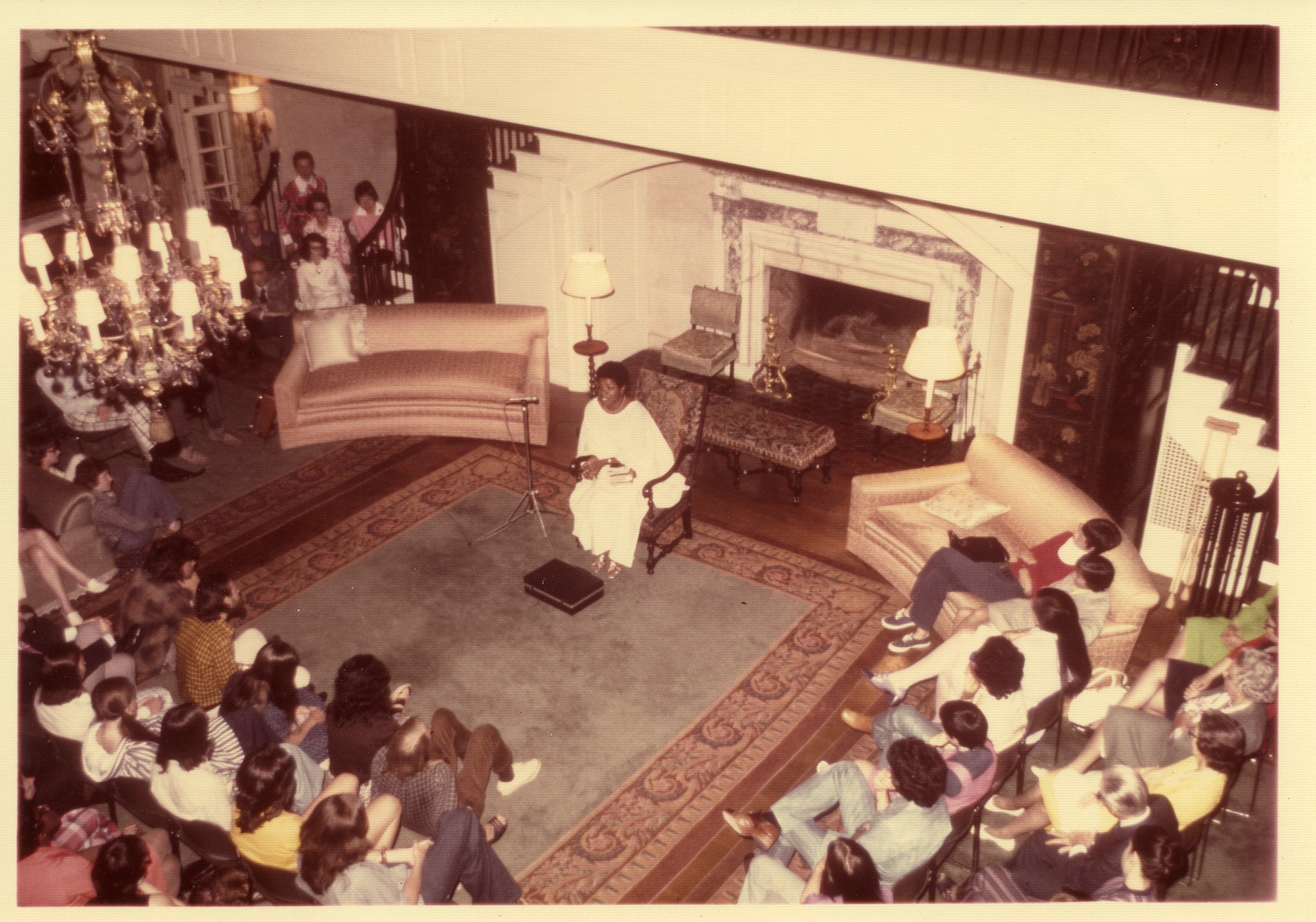
So for our alt text photo, our caption reads: “Seated in front of an audience of Wake Forest University Students, Maya Angelou reads her creative writing in the Reynolda House reception room in 1973.” This event continues to hold rich cultural significance. Having correct, informative alt text assists those using screen readers and sparks curiosity around the image itself
ASL (American Sign Language)
Narrator: Presley Allsbrook
American Sign Language, also known as ASL, is a visual language used by the Deaf community in the United States and parts of Canada. Unlike spoken languages, ASL relies on hand shapes, movements, facial expressions, and body language to convey meaning. It’s a full-fledged language with its own grammar, syntax, and cultural nuances.
For native ASL speakers, this language is not just a communication tool—it’s a crucial part of their identity and culture. ASL allows them to express themselves fully and engage deeply with others.
ASL interpreters and resources enable Deaf and hard-of-hearing students to participate fully in classes, discussions, and campus life. This support helps ensure that they have equal opportunities to succeed academically and socially. Captions, while important, don’t replace ASL because they primarily serve as a translation of spoken language. They don’t fully capture the nuances, cultural context, and non-verbal cues present in ASL.
Supporting ASL not only benefits Deaf and hard-of-hearing individuals but also enriches the entire community by fostering understanding and collaboration across diverse groups.
Assistive Technology
Narrator: Robert Vidrine
Assistive technology is any tool that is used to increase, maintain, or improve functional capabilities for engaging with material. Such tools include mobility devices and special switches like sip-puff and pointing devices to support people with limited movement or motor functionality. Adaptive strategies like Keyboard-only navigation for people who cannot use a mouse or who choose not to. Braille displays and screen readers support people who are blind or low vision, and captions help language learners and those who are deaf or hard of hearing. If technology is not designed with accessibility in mind, assistive technology may not be able to function well and people may encounter barriers. Many people use assistive technology to thrive within the digital space, and accessible systems and content ensures successful engagement for those with disabilities who rely on assistive technology.
Captions
Narrator: Sarah Wojcik-Gross
Captions are a time-synced text version of the audible part of a video, whether it’s a tv show, movie, or computer presentation. Accurate and complete captions include spoken words and meaningful sounds, and might be called “quality captions”. Quality captions improve engagement for everyone and remove communication barriers for people who are hard of hearing or d/Deaf. They are also important to anyone who benefits from reinforcement of spoken information through text. Closed captions can support concentration and understanding, and can have a significant positive impact on those learning a language, people with learning disabilities, those who are neurodivergent, and more. They also provide environmental support for varied situations, like loud or quiet spaces. Finally, captions can help people with comprehension of dialogue when technical terms, jargon, or accents are in use. Try to use quality captions on all your videos, even those for casual sharing!
Color considerations
Narrator: Jonathan Milam
What does color contrast mean and why do color choices matter? Color contrast is the difference in brightness between foreground and background colors. Color contrast impacts the readability of your visual content on the web and in your printed materials.
Good color contrast helps improve text legibility for your audience, including those with low vision or color vision deficiencies. When choosing fonts, pick the largest reasonable fonts and legible font types like sans serif and fonts with distinct letters. This will make your text as legible as possible. Finally, make sure color isn’t the only way you convey information, always give another clear indication like using a red x and green check or better yet a specific word like “important” to signify the difference shown in color.
Fonts and styles
Narrator: Shari Lewis
Choosing the right font style and formatting can have a major impact on the accessibility of your digital content. Keeping fonts simple, using strong color contrast, and not relying on formatting alone to convey meaning can all help support legibility for everyone.
Choose simple fonts, like those that are sans serif and have distinct letters, since some decorative or ornate fonts can be difficult for some to read and increase reading fatigue.
Aim for strong color contrast between the text and the background, so the text is bright enough to be easily distinguishable.
Your font size should be no smaller than 11 or 12 pt in your documents and between 18-21 pt for your slide presentations.
If it’s vital to draw attention to specific text, avoid relying solely on font formatting, such as bold or italics, a color highlight, or a different color of text. Such formatting may not be readily perceived by those with some disabilities, like low vision, blindness, or color vision deficiencies. If you want to emphasize specific text, you can use color, but also add a word or symbol (like an * asterisk) to share the meaning. For example, if you want to highlight mandatory items in red text, add the word mandatory next to those items as well, or you could also add a legend to say an asterisk indicates mandatory items, and then mark mandatory items with the asterisk symbol.
For styling URLs or hyperlinks, these should be underlined and have a distinctive color, to help them stand out from the rest of your content. Try to reserve underlining exclusively for links.
And if you aren’t sure where to start when working with text, keep your font size medium or large, your contrast strong, and your font style simple!
Good heading structure
Narrator: Madi Shaver
You may have heard about good heading structure but were unsure what it was or when and how to use it. Heading structure acts as a hierarchy of heading topics and subtopics that creates a sense of organization for your document.
Good heading structure also allows assistive technology users to quickly get an overview of the topics included in your document or web page. If your headings nest like an outline, it is very easy to navigate by heading levels using only the keyboard. Nesting your headings will also provide a better skimming experience for visual users as well. You should always start with a heading level 1 for your title, and then arrange the subtopics semantically, so that the additional levels nest like an outline. Also, be sure not to skip heading levels, as using a level 2 followed by a level 4 heading will make your content layout confusing as some may look for nonexistent heading levels. Finally, be sure you are only using headings to identify sections and subsections, rather than using them as a visual style to highlight important information or concepts.
Keyboard navigation
Narrator: Jonathan Milam
Keyboard navigation is critical to good technology accessibility, and is also something you could use if your mouse battery dies.
It’s easy to test a website or software app to see if it works for people who rely on or who choose to use keyboards to navigate. Just be sure that all of your actionable elements can be accessed using the tab and shift+tab keys. You’ll also want to be sure you use focus indicators, which are commonly presented as an outline around each web element. This helps someone visually track their location throughout your site. If you’re interested in doing more testing, there are free screen readers available like Narrator in Windows, and Voiceover on Macs and in iOS that can help guide you through this part of your accessibility journey!
Learn More
List structure
Narrator: Tracy Mills-Howell
Bulleted or numbered lists make reviewing content better for all users, including those using assistive technology! But this is only the case when the items in the list are all linked together structurally as a list using formatting tools.
It is not useful to visually mark items to suggest a list, such as by typing numbers or inserting images to act as bullet indicators. When lists are formatted structurally, screen readers will speak the total number of items in the list itself and indicate when the list begins and ends. As an example, a screen reader might say “List with 3 items, red, green, and yellow”.
You should always make your lists easy to organize and navigate. If the list has a logical order, we recommend using numbers or letters for the items. If it doesn’t have a specific order, you can use bullets instead.
Meaningful link text
Narrator: Davita DesRoches
Meaningful link text tells the user where a clickable hyperlink is directing them or what they should expect to find when they click the link. To be meaningful, every link should convey this information! The linked text should also be unique within a page and purposeful when read out of context. Instructing a user to “click here” or “read more” is not as meaningful as a link that says something like “Wake Forest Accessibility Guide”.
Meaningful links make it possible for everyone, including those using screen readers, to skim a page, find what they need, and know exactly where a link will lead them.
For your linked images, the alt or alternative text for the image should indicate the link’s destination, rather than the actual web address or a visual description of the image.
For example, if you featured the WFU logo as a linked image to the WFU home page, you wouldn’t want to use the WFU logo or the actual web address as your alt text. Instead, indicate that the destination is the WFU home page.
Creating meaningful link text is a simple but impactful accessibility practice, and once learned, it can become an effortless habit!
Reflow and magnification
Narrator: Jonathan Milam
We’ve talked about accessibility using alt text and color contrast, so now let’s talk about reflow and magnification. For those in your audience with low vision, they may need to enlarge text to make it easy to read. Sometimes only a small amount is needed, and sometimes a magnification increase is needed to 200 or even 400% in order to read it.
When a person uses the zoom feature in a browser to scale your digital content, the text should reflow, which means it is presented in one column. This makes it easier to read and eliminates scrolling in two directions (only up or down scrolling should be required). This is especially important for low-vision users and for those using tablets and smart phones when visiting your website.
Sign‑on & login pages
Narrator: Jonathan Milam
Accessible sign‑on and login pages are essential for ensuring that all students, faculty, and staff can independently access the digital tools they rely on every day. These entry points must work seamlessly with screen readers, keyboard navigation, voice input, and other assistive technologies so that users with visual, motor, or cognitive disabilities can authenticate without barriers. Clear labels, predictable layouts, and accessible authentication options help prevent lockouts and reduce frustration, allowing everyone to reach course materials, campus services, and academic resources. Prioritizing accessible login experiences strengthens equity across the university community and supports a more accessible digital environment.
Universal Design
Narrator: Jonathan Milam
Let’s talk about Universal Design or UD as a strategy to promote accessibility in our instructional materials and spaces. We would guess that most of you are familiar with some aspect of Universal Design, but we want to provide some concepts on how it relates to instruction so that we’re all on the same page.
All applications of Universal Design should be inclusive, accessible, and usable in physical or digital environments and elements. UD in instruction does not replace other teaching philosophies, but instead it complements and enhances them.
Universal Design in Instruction encompasses the basics of Universal Design, the principles of the Web Content Accessibility guidelines, and the overall UD for Learning principles. Together these principles suggest that we make our interactions and content:
Equitable for use across people’s circumstances and technology.
Simple, intuitive, and timely useable access
Flexible, so they are operable regardless of engagement strategy
And finally, Understandable
Choosing accessible defaults and providing multiple ways to learn, engage, act, share, and reflect can help you achieve these goals.
Universal Design instructional efforts not only support those with disabilities, but also students with a variety of other cultural, socio-economic, and identity characteristics.
So how do you get started? Start with the next thing. We know you have many pieces of content and activities already developed. Although ultimately we would hope to enhance accessibility for all materials, we also understand that this isn’t a realistic way to start. We recommend that you begin by building in Universal Design to enhance the next new thing or the next revision of an activity or within your content. Practice the process and keep going from there with additional elements of your instruction!
Interviews
Mark Anderson
Mark is the associate Vice President of Strategic Communications at Wake. In our latest episode, he discusses his personal and professional commitment to digital accessibility, explaining how removing online roadblocks simplifies complex university processes for everyone.
Eudora and Jonathan’s Ace Fellowship interview
This was an interview recorded in 2022 as part of the Ace Fellowship Program podcast series hosted by Wake Forest faculty members Brian Calhoun and Erin Binkley. Listen as Eudora and Jonathan discuss their roles in evaluating and improving the accessibility of campus websites and applications through the Technology Accessibility Program, focusing on making technology usable for everyone across the Wake Forest community.
Ashley Cranford
Ashley Cranford, the outgoing Information Systems Fellow discusses her journey and work, emphasizing the importance of accessibility at Wake.
Madi Shaver
Madi is the current IS fellow for this academic year. Check out her interview to learn more about her and what her future holds beyond Wake.
Malika Roman-Isler
Malika is the Associate Vice President for Inclusive Excellence in the Office of Diversity and Inclusion. She joins us to discuss the synergy between inclusive excellence and technology accessibility.
Barbara Stephens-Macri
Barbara is part of the Staff Development team within Facilities and Campus Services and has worked in several different departments during her time here at Wake. She joins us to talk about her career and the importance of accommodation in the accessibility space.
Molly Keener
Molly is the Director of Digital Initiatives & Scholarly Communication and joins us to discuss the importance of accessibility in her work. You can also learn more about Open Access and WakeSpace.
Brian Calhoun and Erin Binkley
Erin and Brian are two campus professors and provide us with a very insightful interview about the importance of technology accessibility and tell us about their campus community podcast.
Elena Clark
Elena Clark, a professor in the Department of German & Russian, connects with us us to talk about how technology accessibility is part of her work, research and writing.
Davita DesRoches
Davita DesRoches is the Alternative Media Specialist for the Center for Learning, Access, and Student Success, and joins us to talk about her enthusiasm for accessibility.
Libby Welborn
Libby was the IS fellow for this academic year. Listen to our interview with her to learn about her future plans!
Meredith Mulhearn
Check out our inaugural interview in our A11Y Audio series with Meredith Mulhearn, and hear how her work as an artist intersects with technology accessibility.
More videos relating to technology accessibility are available by subscribing to our Kaltura channel. You can also visit the A11Y Audio Kaltura playlist directly as well.